Two Presidents Walk into a Convenience Store
The people of New York were shocked when former President Donald Trump made an appearance at a bodega in Harlem amid his own court battle. Crowds of New Yorkers swarmed [...]
QUESTION:
Hi
I read this blog post and took a look at Nasa´s own homepage. Well, they are surely promoting this climate change hysteria.
What I would like to know is if it is declining according to these statistics how do they think they can get away with this scam?
Also when I look at the statistics it looks to me as if it´s actually increasing …?
Could you please explain
C
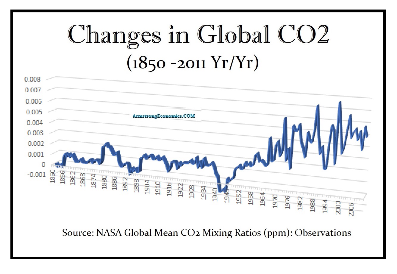
REPLY: The chart is the rate of change. These people are claiming this is a climate emergency. Taking NASA’s data, yes the PPM is rising but the rate of change has been declining. So there is no climate emergency. On top of that, the times where there have been spike correlate to war, not to the number of cars on the road. I have stated before that there is ABSOLUTE proof that carrots are deadly because every person who has ever eaten a carrot has eventually died. That is an undeniable correct statement. But omitted is the fact that even those who have never eaten a carrot has also eventually died.
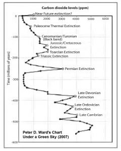
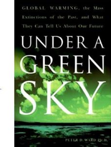 The book that started all this nonsense was written by paleontologist Peter D. Ward entitled “Under a Green Sky” published in 2007. He theorized that the proposition of simply measuring the average CO2 concentration and concluding that CO2 was the reason for mass extinctions is a really questionable analysis. It is true that CO2 levels have been massively higher than they are today. Looking at his chart, we are at a historic low similar to the 5,000-year low in interest rates. Any uptick is by no means cause for the assumption that will become extinct in 12 years. Ward argued that the Permian Extinction event was distinguished with very high atmospheric CO2 (3,000 ppm) levels which created a runaway Greenhouse Effect. According to current measurements, we are at the 400 level. There is not enough data to confirm his theory is correct.
Moreover, the 1930s saw the coldest period in modern history and that is when CO2 level rose the most. There was cooling, not warming. All the charts these people use are from 1850 forward. Historically, CO2 has been substantially higher well before the Industrial Revolution.
The chart I have shown is the rate of change, not the empirical level which they show. This is like a market that presses high but is running out of momentum. The rate of change is slowing down warning there is not climate emergency that these people are claiming.
I find it curious that the sharp increases in CO2 correlate to wars. It peaked in 1930s and began to decline. The 30’s were the coldest period.
